How to create a scalable template
Overview
This article presents how to create a scalable template using a text editor in order to utilize the templates in Windchill.
Introduction
In order to create a scalable template, the first thing to do is to edit a template manually with a text editor.
There are some svg attributes we need to work with:
- Width
- Height
- ViewBox
- preserveAspectRatio
For each element we also have their “x” and “y” values, which indicate the elements position inside the svg viewBox.

The viewBox basically defines what you’ll see of svg, based on the coordinates of the svg elements.

The preserveAspectRatio attribute lets you define if we should preserve aspect ratio and how do we wish to do so. More info here.
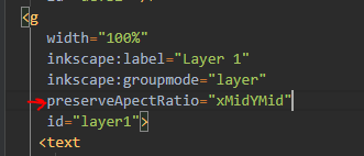
By default, if not specified, it will use the xMidYMid method, which basically means that it will center the svg into the viewport and scaled it preserving aspect ratio.
How to
The first step is to replace the svgs width and height parameters with the following keys: Note: if the keys are already as they are displayed by default, do not change them.

This way, when the watermark engine watermarks a pdf page, it will replace those keys in the svg with the pdf’s width and height. So, the svg size is now the same as the pdf page.
The viewBox used in this example is the one that matches an A4 paper size.
The preserveAspectRatio attribute is the default.
If a pdf page has a different ratio from the one described by the viewBox, then it will scale the svg keeping its aspect ratio until either the svg height or width meets the pdfs page height or width respectively.
There are two ways to create a scalable template. The first is by modifying the aspect ratio, and the other is by not modifying the aspect ratio at all.
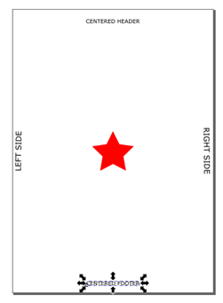
We are going to use the picture below, taken from the Inkscape, to create the two different options.
Preserving aspect ratio
When watermarking the pdf which size is 337.3 x 436.6 and the ar is 0.772 (ar = width / height). Result:
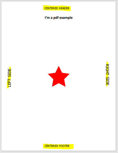
Header, footer and the star in the middle are positioned properly, but the left and right text are not as close to the edges as they should be.
This is because there is a difference in aspect ratio.
- svg AR => 210 / 297 = 0.707
- pdf AR => 337.3 / 436.6 = 0.772
So the pdf page has a higher aspect ratio than the svg, so, horizontally, the template doesn’t work as expected.
If the aspect ratio of the pdf is higher than the one of the svg, it will always scale properly in vertical direction, but not horizontally. This option would be perfect if you are using only header and footer. It will work most of the time.
If the aspect ratio of the pdf is lower than the one of the svg, it will always scale properly horizontally, but not vertically.
Another example:
Pdf size = 508 x 392 => ar = 1.295
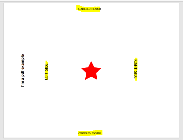
The opposite case:
Modifying the svg template viewBox attribute = 0 0 297 210 => ar = 1.414
Result of a pdf with size 508 x 392 :
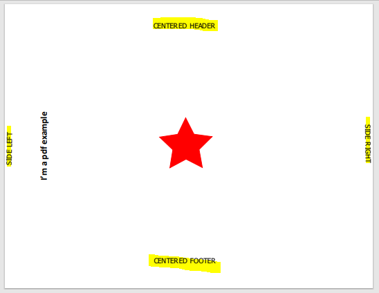
Result of a pdf with size 392 x 508:
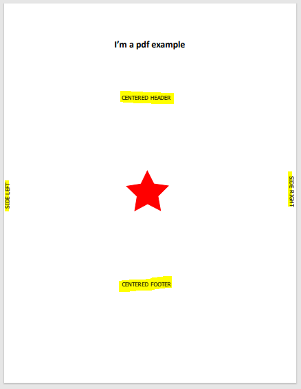
The advantage of preserving aspect ratio is that text, shapes, images will never be distorted.
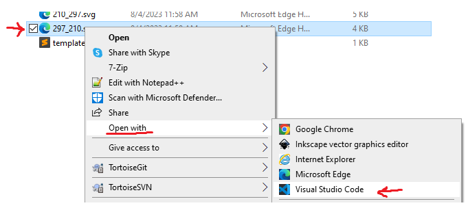
The disadvantage is you may need to create multiple svg to match different aspect ratios. If my template contained both the 210_297.svg and the 297_210.svg then I would get the best of both.
The other option is to not preserve aspect ratio, in this case the svg will fit the pdf page but depending on the viewBox you use, text, shapes and images… will be distorted in different ways as shown in the following examples.
Not preserving aspect ratio
Modified svg manually to not preserve aspect ratio: Note: Only one svg will be used as an example, in this case we will use 210_297.
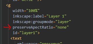
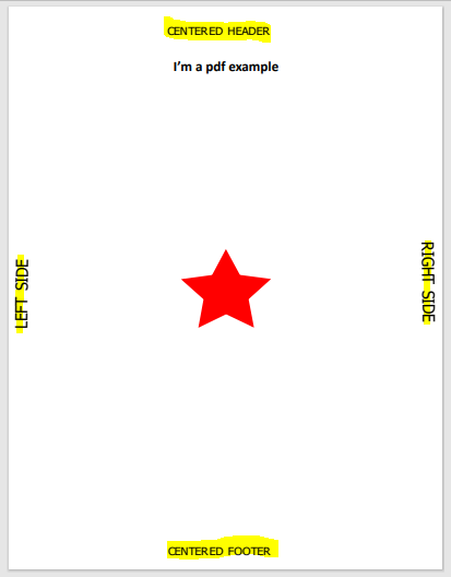
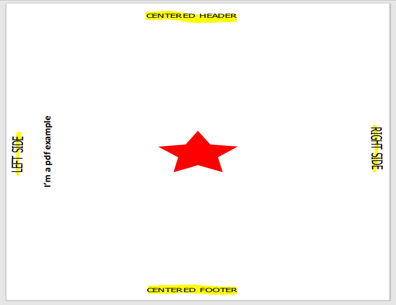
You can see how the image is distorted for the image above, because the resize was done to fit a pdf with a very different aspect ratio compared to the svgs.
So, at this point it works fine in the sense that every element is positioned where you want it to be, yet very distorted.
If you add the 297_210.svg template and modify it so that it doesn’t preserve aspect ratio, we will get better result:
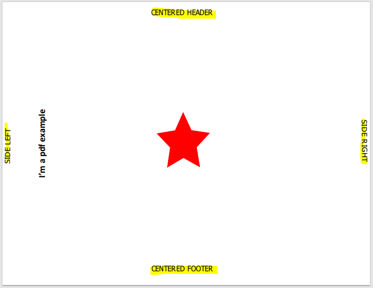
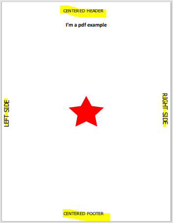
Conclusion
Depending on the characteristics of the template you want to use in watermark, you should use preserving aspect ratio in some circumstances. If you only use one template containing header and footer, the best option to consider is preserving aspect ratio. Otherwise, if you have a template with text on the sides, the best option would be not to preserving aspect ratio, and create as many template sizes as you need for your watermark.